SolarEdge is one of the most widely installed solar inverters in the country for several good reasons. The brand is reliable, the equipment is proven to last, and the monitoring platform gives you a detailed look at how your system is performing every single day.
But once your system is activated and you open your SolarEdge app for the first time, it’s completely normal to feel like you might need a complex user guide just to figure out what you’re looking at.
Their monitoring app shows you a live power flow diagram, production data, optimizer performance, and battery controls if you have storage.
There’s a lot going on, and none of it is obvious without some context. That’s exactly what this guide is for. And even though our team walks you through the app when we first activate your system, this is worth bookmarking for whenever a question comes up down the road.
By the time you’re done reading, you’ll know exactly what your system is doing at any moment and how to confirm everything is working the way it should.
Your Main Dashboard
When you open the mySolarEdge app and log in, your main dashboard is organized into a few key sections that will provide you with all the information you need to see if your system is performing properly.
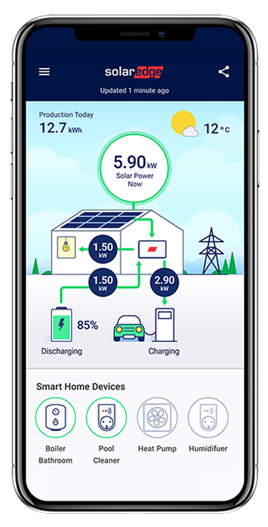
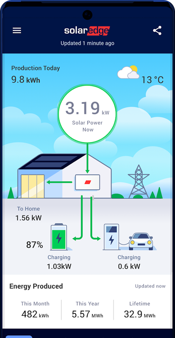
At the top you’ll find your site overview, which shows historical production starting when your system was first installed. Below that is the power flow diagram, which shows you a real-time illustration of where your energy is moving right now between your solar panels, your home, the grid, and your battery if you have one.
Further down you’ll find your power and energy data broken down by production, grid activity, and also a comparative energy section that lets you look at performance across different time periods.
The background of the app actually shifts based on the weather and time of day, so a clear afternoon looks different from an overcast morning. It may sound like a small detail, but it reflects that the app is pulling real-time conditions instead of a static screen.
Important: The app updates your data approximately every 15 minutes. You’ll see the timestamp of the last update on your dashboard. This is not a live second-by-second feed, so if you check the app immediately after turning something on in your home, give it a few minutes before coming to any conclusions.
The Power Flow Diagram
The power flow diagram is one of the most useful sections on your dashboard. It gives you a real-time illustration of where your energy is going at any given moment, and once you understand what it’s showing you, it becomes the quickest way to get a read on your system’s current state.
When solar power is flowing toward your home, your panels are covering your electricity needs directly. When that flow points toward the grid, you’re producing more than your home currently needs and sending the excess back to your power company as net metering credits.
When the grid flows toward your home, you’re pulling utility power, which is completely normal at night, on overcast days, or any time your usage runs higher than what your panels are generating.
And if you have a SolarEdge battery and see it sending energy to your home, your battery is covering your home’s demand without pulling any power from the grid.
The numbers shown reflect the current wattage or kilowatts for each specific flow. Since these numbers update approximately every 15 minutes, what you’re seeing is a recent snapshot instead of being an instantaneous reading.
The power flow diagram shows where your energy is moving between solar, your home, the grid, and battery storage.
Your Production Data
Your production data shows you how much energy your system has generated in a selected time frame. That could be set as today, this month, this year, or even over the full lifetime of your system since it was installed.
These numbers accumulate every day your panels are producing, and watching the lifetime number grow over time is definitely one of the more satisfying parts of producing your own power with solar.
The app also includes a color-coded graph that gives you an hourly picture of your system’s output for any given day. On a clear day, the curve looks like a smooth hill, low in the morning as the sun is rising, then climbing to a peak around midday and declining through the afternoon.
On partly cloudy days, the line bounces up and down as clouds pass over your home. Both of these scenarios are completely normal and to be expected.
You can toggle between daily, weekly, monthly, and yearly views. If something looks off on a single day, switch to the weekly or monthly view first to see whether it’s a weather-related dip or part of a consistent pattern that’s worth addressing with your installer.
The comparative energy section lets you go further and compare performance across different years, which becomes more and more useful after your system has been running for a full year or two.
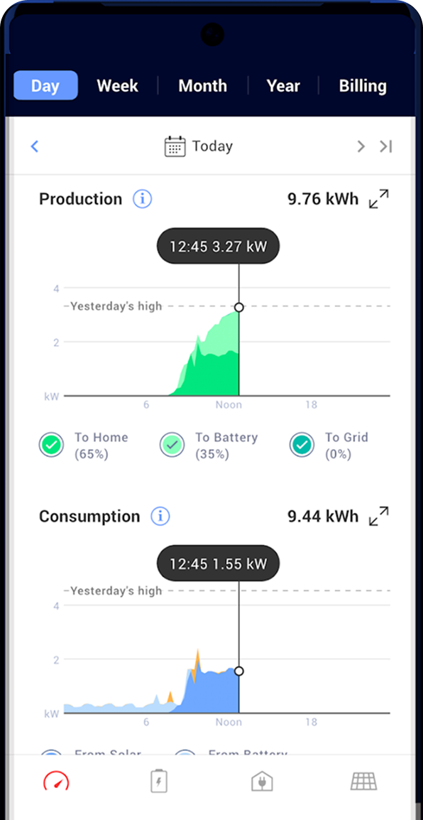
Production data helps you review daily, monthly, yearly, and lifetime system performance.
Pro Tip: Your production data is the most important number to track over time. At the end of your first full year, compare your actual annual production against the estimate your installer gave you when you signed up. That’s the number that tells you whether your investment is delivering what it should. If it’s more than 10% lower than expected, it would make sense to contact your installer to review your performance details from the last year.
Battery Modes: Which One Are You In?
If you have a SolarEdge Home Battery, the mode it’s set to controls everything about how your battery charges and discharges throughout the day. You can check and change this by tapping the Battery icon on the bottom of the app and going to Battery Mode.
There are three main modes to know about.
Maximize Self-Consumption
Maximize Self-Consumption stores solar energy during the day and uses it to power your home after the sun goes down, reducing how much you draw from the grid at night.
Time of Use
Time of Use charges your battery when electricity rates are cheapest and discharges it during expensive peak-rate hours, using SolarEdge’s algorithm to learn your usage patterns and optimize accordingly.
Backup Only
Backup Only keeps your battery fully charged at all times and reserves it only for grid outages, so your battery power is available exclusively when the grid goes down.
For most of our customers in New York, we recommend Backup Only. Since New York has 1:1 net metering, there is no financial benefit to pulling from your battery during the day. Your solar production earns full retail credit when it goes to the grid, so the best use of your battery is to keep it full and ready for an outage.
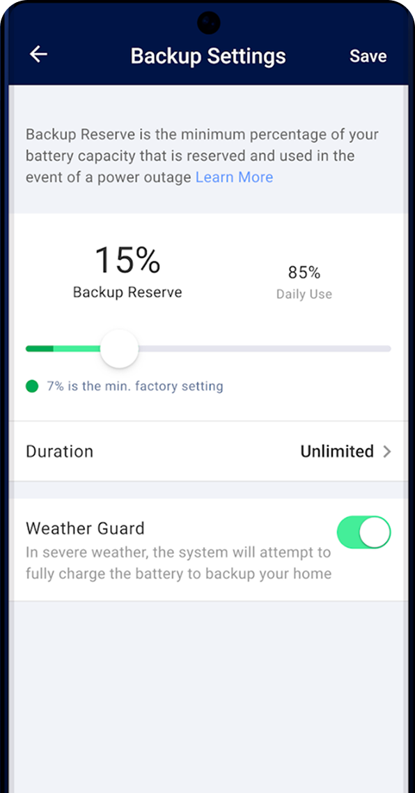
Pro Tip: Within any mode you can also set a Backup Reserve percentage, which is the minimum charge your battery will always hold back for emergencies. You can adjust this in the Battery Mode settings. A 20% reserve is a reasonable starting point if you’re not in Backup Only mode.
Weather Guard For SolarEdge Battery Owners
Weather Guard is one of the most useful features in the mySolarEdge app.
Here’s how it works. When a severe weather notification is received from the National Weather Service, your SolarEdge system begins charging your battery to full capacity using solar and grid power. Activation begins within 48 hours of receiving the notification.
When the weather event ends, your battery automatically returns to its normal charge settings.
For New York homeowners dealing with snow and ice storms along with summer thunderstorms, this is an extremely valuable feature. Without this feature enabled, you may find yourself in the middle of a storm with your battery at 40% or 50%, which significantly limits how long it can power your home if the grid goes down.
To enable Weather Guard, open the SolarEdge app, go to the Storage section, and turn on Weather Guard. Once it’s active, it runs quietly in the background.
Weather Guard can help prepare your SolarEdge battery before severe weather arrives.
Pro Tip: Enable Weather Guard before winter hits. There’s no reason not to have it on if you have a SolarEdge battery.
Final Thoughts
Once you understand what the mySolarEdge app is actually showing you, it stops feeling like a dashboard full of confusing data and starts feeling like a clear picture of your solar panels working for you every day.
If you’re an Empire Solar customer and something in your SolarEdge app doesn’t look right to you, don’t hesitate to call our team. We can access your system remotely and tell you exactly what’s going on. Sometimes we can even troubleshoot and resolve the issue without ever sending someone out.
But if you’re reading this because you’re still thinking about going solar, we’d love to show you what your home and savings could look like.
Want to see what solar would look like for your home?
Empire Solar has installed solar for over 7,300 New York homeowners since 2015. We’re 1 of only 4 installers to receive NYSERDA’s Platinum Installer Award out of hundreds of companies in the state. We’d be happy to show you exactly what your system would produce and what you’d save over time.
Request Your FreeSavings Plan